We have the pleasure of working with an amazing brand communications company every now and again and some of our favourite websites we’ve produced are based on the branding that Projector create.
We thought it was about time we dedicated a blog post to the creative efforts of the guys over at Projector and highlight ten of their best identities they’ve produced.
1. National Apprenticeship Business

The arrow marque symbolises a fresh, more radiant change in direction, moving onwards and upwards from an older path. We’re excited by the flexibility that this graphic gives us and look forward to producing some strong graphical work for NAB in the very near future!
2. Business Impact

The new identity clearly defines what they are about and gives them a positive, approachable and professional look. By combining business like purple and grey colours with a vibrant pink we ensured the brand will appeal to everyone from Managing Directors to the ground floor staff. The three lines represent the three groups involved in the business 1: Business Impact 2: The Client and 3: The Trainees.
3. Skyrocket

A simple, unique logotype was developed to represent the unique nature of dealing with human resource issues and staff related training. The elongated descenders were created to symbolise the value of the business – demonstrating the effect Skyrocket has on their client’s bottom line.
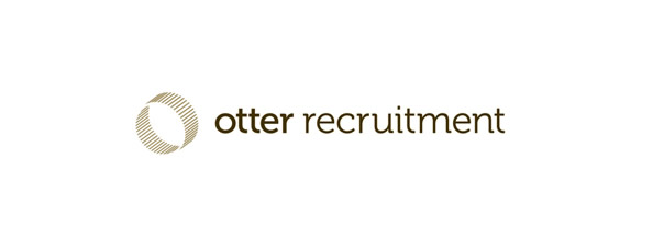
4. Otter Recruitment

We created a logo marque that subtly reflects the ‘O’ of the company title and has a dynamic, corporate feel to it that looks fresh and positive. These elements are also reflected in the modern typeface which is classy yet friendly and has good legibility. A warm black used alongside secondary gold colouring completed it’s prestigious feel. We then went on to roll the brand out across the online and printed elements which included a full stationery set and Direct Mail campaign to help raise awareness.
5. Zenith People

Changing from Zenith Recruitment to Zenith People our first task was to re-energise the brand personality by adding more emotion and charm – without diluting the serious capabilities of Zenith. Building on this we created an integrated look and feel to bring the companies communications under one umbrella – using the 6-point star as the focal point for all client and candidate dealings, we created a set of 6-point processes for the business.
6. Access

Access are one of North East England’s most successful training providers and have been around for over 20 years. They have supported employers to develop their workforce and have helped over 4,000 young people into employment on their chosen career ladder through apprenticeships. We wanted the new logo to be representative of the support Access provides to all it’s stakeholders and created an abstract marque to demonstrate this.
7. havetolove

havetolove was an adaptation of an existing logotype already in existence for havetohold. We developed the logotype for the new business to include the heart and symbolise the values of the new boutique in a graphical treatment. It was a gift, sometimes these things are.
8. Mobilx

We created the Mobilx logo to symbolise their core area’s of trading: importing and exporting. Working with a business like colour palette we wanted to show the grown-up, confident side to this new business to help establish it within the US marketplace – and the silver was used to represent the technology sector they focused on.
9. Managed Lets

The Logo is based upon the passing of knowledge throughout the franchise of the Managed Lets brand. For example, the Managed Lets system is passed on to the property owner, who then passes on their knowledge of the area to the person renting the property. This is represented as a benevolent relationship between two people. The typeface chosen suits the logo and gives an overall feeling of friendliness.
10. Cathedral Lettings

We introduced a graphic finger print design within the shape of a house. This reflects the personal service that Cathedral has become known for and also clearly defines their offering as a business. A traditional, dark green colour used alongside a vibrant green kept the brand professional but with a modern freshness and a clean legible typeface completed the brand.
Head over to the Projector Website and take a look around.