We have been promoting ourselves as the best web design Newcastle has to offer via our website and email marketing for over ten years now, and they have certainly changed over the years. Everything we produce is now focused around a responsive approach, making sure we cater for mobile and tablet users. This approach should also apply to responsive HTML email design and build too.
We all know email marketing can be an effective way to communicate your offering to your customers and potential customer base.
2013 was a big year for mobile email and by December, 51% of people where opening their email on a mobile*** and this is growing month-on-month as we progress through 2014.
If you’re thinking about email marketing, you’ve got to be thinking about catering for mobile and tablet users and what this means to the design and content of your emails to make sure they render correctly across these devices.
So why is it so important to design your email campaigns to mobiles?
Well, there are some pretty hefty statistics to support the ‘why’, especially for consumer focused campaigns:
- Revenue per mobile click is almost double that of a desktop click. – Yesmail “Email marketing compass: consumer purchase behaviour” (2013)
- Daily we spend 9 minutes on email via a mobile device, that’s 7,6% of the total 119 minutes we use our phone per day. – O2 “Mobile life report” UK (2013)
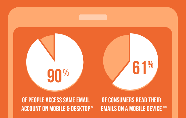
- 90% of smartphone owners access the same email account on mobile and desktop. – ExactTarget “The 2012 channel preference survey” (2012)
- Mobile emails receive the largest percentage of unique clicks (40%). – Experian “Quarterly Email Benchmark Study” (Q2 2013)
- 30% of consumers now read their email exclusively on mobile devices. – Yesmail “Email Compass: The Mobile Effect” (2013)
It is our job to work with you and make sure we communicate your key messages and content via the mobile version of the email. Content can be arranged in a more positive way to better communicate via a smaller screen, with key calls to action for the mobile user.
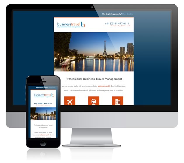
Responsive HTML email designed for Business Travel
Keeping it simple
Some simple design principles we work to when designing and building responsive HTML emails for mobile are:
- Using clear text – often larger for mobile
- Using clear images – often in single column
- Simple layout with your primary content only for mobile version
- Mobile friendly calls to action – such as one-touch ‘Call us’ or ‘Buy now’ links, for example
Maybe it’s time for you to review your email marketing?
We’d love to chat to you about how we could apply our experience and expertise to your email marketing campaigns.
*ExactTarget – “The 2012 channel preference survey” (2012)
**Yesmail “Email Compass: The Mobile Effect” (2013)
***litmus.com (2014)