
With all of the fonts, bright colours, forms, images and everything else that goes into a modern website, it’s easy to forget the main focus of every website on the Internet, content. Every single website was designed and built to carry a message, whether that’s information on your new product launch, video content, or simply informing users of what your business does and where it’s located, every website exists for a reason.
We can help our users decide where they want to go on a website by giving them easy to follow links, which are usually placed in the main navigation section containing links to the usual pages such as ‘about’ and ‘contact us’. These pages are often included on a website because they’re expected by the user. They expect to find some background information on the company and how to contact them, but what about when a user lands on your page and they don’t want that initially? What if a user has landed on your website and they expect you to tell them where to go? Well, that’s where strong design and good use of a call to action comes into play.
The call to action can play a massive role in increasing click through rates and conversions on your website, which can result in improvements in anything from newsletter sign ups to selling items on an e-commerce website. Lets take a look at some websites that utilise these call to actions and also some case studies of successful improvements in conversion rates:
Basecamp
Basecamp is one of the leading project management tools on the Internet, we use it here at Union Room and so do many other companies. Their website has always been a favourite of mine for it’s conversion-orientated design and the fact that every single pixel on the page is there to convey a message and direct the user.
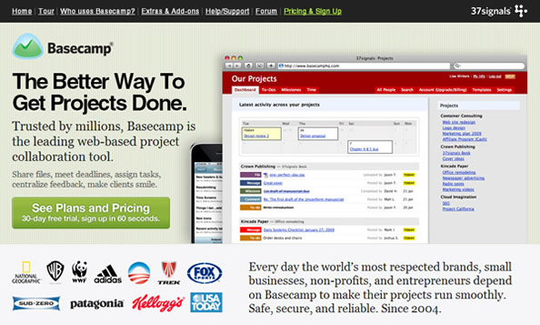
In June of this year, Basecamp launched a redesign of their website. Initially, I was disappointed with what I saw and felt the site didn’t lead users down the page like it’s predecessor. However, after reading a fantastic blog post about the redesign over at 37signals, you can see the new website has been a great success, with “the new design [sending] 14% more people to the signup page“.
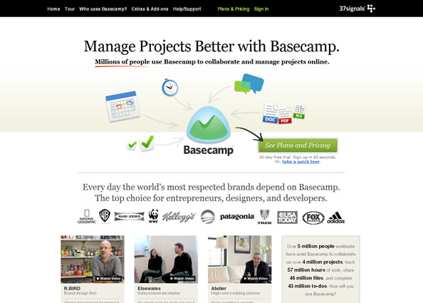
Whilst this improvement in pushing people to the sign-up page doesn’t necessarily translate to actual sign-ups, it does prove that a design with the user in mind can help dictate actions and have a positive effect on their experience.
Whilst the improvements in sign-ups to the new Basecamp website could be attributed to call to actions, it could be said that other elements such as layout, images and text had a hand in influencing these decisions. With this in mind, lets look at some examples of websites benefiting from small, subtle changes.
“See Plans & Pricing”
If you ever want to highlight the importance of page copy to a client, using the 37Signals call to action case study is a fantastic example of what a call to action can achieve. After testing out various phrases on the Highrise homepage for their main call to action button, they settled on the phrase “See Plans and Pricing”. This small change to a buttons copy resulted in a 200% increase in sign-ups, solely through this change.
This approach has became a standard in call to action buttons across the Internet, which you can see below (we’re even intending on using it on one of our upcoming designs, it’s proven so effective).
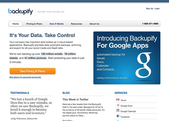
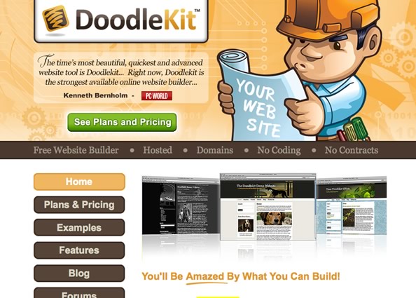
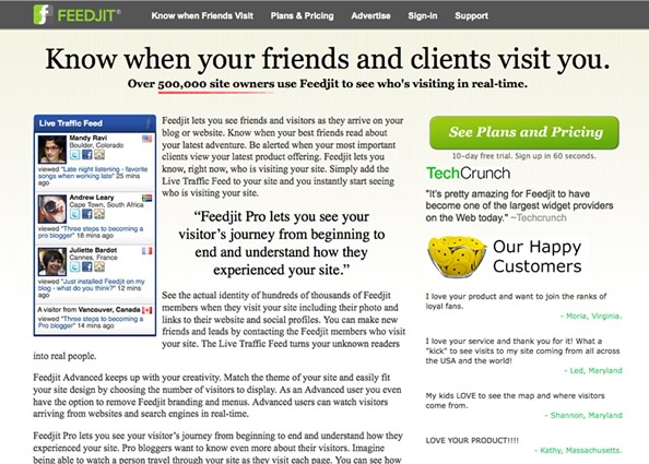
As you can see, although the location and even styling of the buttons differ from website to website, the language is consistent across all of them.
Lets take a look at another example of small changes to language and layout having a big impact on intended actions.
Green vs Red
Consumers in general are dictated massively by colour, take a look at the info-graphic below for more information on just how persuasive they can be.
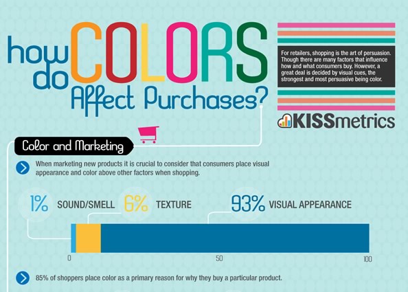
With this in mind, it’s worth thinking about how a call to actions colour can affect click through rates and how one colour may perform against another. If we use the case study of dmix, who ran some A/B testing on two pages with two different colour buttons, it’s clear the effect these colours can potentially have on conversions.

“So far we’ve had 600 participants and our conversion rate has increased 34%“. That’s a 34% increase in conversions in a very short space of time, just through experimenting with the colours of various user-orientated elements.
Language
Another great example of a subtle change increasing conversions, and how language can play a role, is that of the Rypple case study. Rypple played around with different language on one of their call to actions:
“One A/B test we ran was for language. We tested the “Give Feedback” call to action vs. the “Respond Now” call to action in the notification email that advisers receive when their feedback is requested. The result: “Respond Now” resulted in 13% higher click through than ‘Give Feedback’ with a 99% confidence level.“
Another great example of language dictating user actions.
Conclusion
Hopefully this blog post has gone a little way in emphasising the role of content and call to actions in web design and how, when done correctly, they can have a positive impact on any intended action you’d like your user to take. The next time you’re browsing around your favourite e-commerce store, take notice of how they may be trying to influence decisions using language, colour and a call to action.