Although at one point it used to be a fairly standard feature of a website, using a slider in web design isn’t generally the best way to show content.
Today we’re discussing when it is okay to use one, and when it’s quite frankly a daft idea.
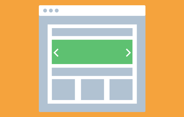
Why isn’t it recommended to use a slider?
The main reason is simple. Very few people actually stick around at the top of the page for long enough to watch more than one, or possibly two, frames. If you don’t mind whether your users see what information is on the 4th frame then that’s fine, but if you planned to put something important on it that you need the majority of people to actually see, then the slider is not your friend. Consider having a large section at the top that just highlights one area, then feature your other information further down the page. It’s much clearer for the user, and helps ensure that it’s seen.
People WILL scroll but they won’t necessarily sit and wait for your slider to do it’s thing.
But we know a lot of our clients do like a slider and we get a lot of requests to include one. We don’t mind too much because a. it’s your website at the end of the day and we want you to love it, and b. because there are also some reasons it’s not the worst idea.
So, when is it okay to use a slider?
Logically it makes little difference when the content in the following frames isn’t crucially important. So it’s obviously okay to use a slider if you’re not worried that your user would be massively missing out by not paying attention to all frames.
If it’s just a slider of photography then it’s not too bad either. A pleasant scroll through a few images, if they’re all of equal quality and importance, can help keep the page nice and fresh. A user might scroll down on one image and scroll back up to another one which is sometimes nicer than it remaining stagnant. We’re also pretty used to viewing slideshows of images so if it’s clearly marked as a slider, and the display catches our interest, we’re more likely to stick around to watch a few of the photos roll past.
We’ve touched there on the third point too – clearly marking it as a slider. Something that just changes and throws up more information while we’re not paying attention isn’t ideal, but if you’ve got your arrows or the ‘dot’ icons in place your user will be much more likely to realise there’s something they’re missing. But even then, don’t count on it!
A slider requires the user to be paying proper attention and then have the patience it takes to wait for the extra content to appear. It’s always worth bearing in mind that the job of a good, well-designed website is to present the relevant information for your user to find as easily as possible, and without them having to do much or any work.
If you’d like to find out what else we know about web design and work together with you on your project please get in touch.