Trends in web design are hard to get away from, one minute we’re all web 2.0, the next we’re scrolling jQuery galleries and textured backgrounds. Lets take a look at some great trends implemented by web design agencies and freelancers on the web today.
Big text
I’ve always been a big fan of big text on websites, the bigger and bolder the better. With this in mind, it’s been great to see more and more websites using not just large titles but also large body text as well.


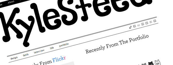
While the websites above showcase some nice big typography, it’s rare that you come across a website that has it pretty much bang on when it comes to typography. A great example of this is the personal portfolio of Kyle Steed…

I very love all aspects of a website, be it colours, type, content, layout, use of whitespace and so on, but I think Kyle Steed gets it all right. It’s also a very nice WordPress integration to boot.
Illustrations
While illustrations on the web aren’t particularly a new thing, they are becoming more prevalent in the actual designs of the sites themselves, rather than being used sparingly.
A great example of this fully blown approach is IndiFolio. The site uses gorgeous illustrations throughout and has some great multi-layered effects when navigating.

Some other websites use illustrations a little less in there designs but still use them to great effect.


Prevalent Blog Work
With blogging and social media in general becoming an important part of a web design agencies day to day activities, it’s no surprise to see agencies making blogs a more important part of their websites. Lets take a look at a few examples of web agencies putting their blogs front and centre.


We’ve also tried to make our web design blog more prevalent on our own site, putting the feed of our blog on our homepage. A lot of web design agencies are beginning to run a blog, even if it’s just information about what’s going on work-wise.
Individually designed pages / articles
This is a fairly new one, and a trend that’s causing a little bit of controversy in the community. Rather than having a set design and fitting the various content into that design, you design the page around the content.
The first real example I saw of this that I liked was Gregory Woods portfolio, using a new design and layout for each topic he chooses to speak about. Although this approach certainly isn’t for everyone, it’s a very refreshing approach to shaping design around content and will certainly have me checking back frequently for new updates.


Another website that uses this trend is Yaron Schoen:


Smashing Magazine also featured a blog post by Paddy Donnelly, which showcased the trend perfectly.

We haven’t covered every trend in here but hopefully we’ve gone some way to showcasing some trends in web design portfolios currently showing on the web. Think we’ve missed anything obvious? Let us know by commenting below…