Following on from last week’s post where we touched on new logos, we’re now talking about the need to make sure your whole site is optimised for mobile by developing responsive web design.
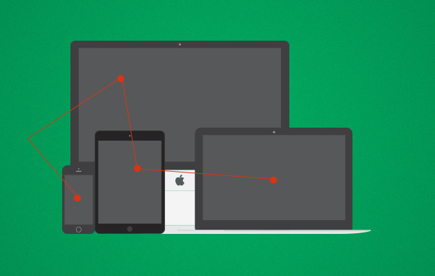
Currently, in the battle of tablet sales vs. personal pc sales, it’s a close call. In fact for the first time it’s looking like tablets might win and this is only going to increase as we head into 2016. Smartphones too are obviously still on the rise, both in the popularity and the sophistication of the devices themselves. Which means that it’s highly likely that a good chunk of the traffic to your site is now mobile. You yourself may be reading this post whilst at your desk, experiencing it in all of its glory on a ‘proper’ screen, you could be reading it on a tablet over lunch, or you might be giving it a brief glance on your smartphone between meetings. Often as much as 70% of people browsing are doing so on a mobile device, depending on the industry you’re in. We’d certainly say its inevitable that responsive design will continue to be a requirement.
So, clearly it’s vital to have a site that is responsive but what does this actually mean?
In simple terms it means your site works equally well across all of the various devices.
It knows the resolution of the device you’re viewing the page on through identifying the type of browser being used, and adapts to best fit that screen. In terms of accessibility it’s pretty much a necessary tool for your business.
We’ve all been in the position of trying to load, navigate, and decipher a site on a mobile device that was clearly not built with a tiny screen in mind. You’ll want to avoid putting your visitors/potential customers through that frustrating experience, lest it hinder their experience and send them in the direction of a competitor.
The good news is most people are cottoning on to the idea. Certainly we now build with the fully responsive site in mind from the very beginning of a project. This kind of planning offers the simplest and most cost effective way of reaching the maximum number of visitors across multiple devices. Happily this ensures a great experience for every user, on every screen, and helps future-proof your site a bit to make sure it will continue to be user-friendly for the foreseeable.
If this is something you think we could help you with get in touch!