The merits of having a website designed for mobile usage can’t be ignored, you only need to look at some of the latest statistics:-
- Over 1.2 billion people access the web from their mobile devices.
Source: Trinity Digital Marketing - 56% of people own a smart phone.
Source AF-Studio.pl - 61% of people have a better opinion of brands when they offer a good mobile experience.
Source: Latitude - 50% of mobile phone users, use mobile as their primary Internet source.
Source: DigitalBuzz - Mobile web browsing accounted for 30% of all web traffic in 2012 and is expected to grow to 50% by 2014.
Source: LocalVox
Still not convinced? Read on…
Recent studies have found that more than a third of us now visit websites and view marketing emails on our mobiles and other hand-held devices. That’s a massive audience all wanting to act immediately. The problem is that so many companies still rely on optimising their website or emails for traditional PC screens meaning their audience have to scroll in an awkward fashion on their tiny hand-held devices to view your content. Many lose patience with this experience and give up, or worse still visit a competitor website that do offer a mobile friendly website.
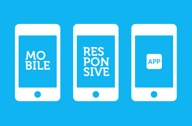
Different types of Mobile Websites
If you are considering heading down the mobile route, your certainly in the right ballpark, but deciding what kind of mobile site you need can prove to be very difficult. Although there are a few variations there currently stands 3 main ways in which you can have a mobile site. They are:
A mobile version of your website
Simply put a version of your existing website is created for mobile usage. It normally sits on a m.yourdomain.co.uk and will automatically be directed to the mobile site when a user visits on a mobile device. As mobile devices differ from handset to handset i.e. screen resolution, operating system etc it means the developers need to make revisions and test the mobile site for every device. This was fine a few years ago when devices were limited to a few, but now there are so many devices on the market it wouldn’t be practical or cost effective to design for everyone. You must decide with your developer which devices you will cater for. You may decide that whilst researching different statistics that a large proportion of the mobile market are on Android and IOS (iPhone’s) so you will design for these and forget about the others like Blackberry etc.
A mobile version of your site can also prove quite cost effective, certainly in the short term and especially if you are only developing for a selected number of devices. It will follow the same design as your current site and re-use similar assets like images, content and structure.
+ Pro’s: Can be cost effective.
– Against: Two versions of the website to maintain. Unpractical to design for all devices and operating systems meaning you may miss potential visitors.
A specific mobile site can be a great option to compliment your existing website.
An App
Strictly speaking this isn’t a mobile version of your site, in that when people browse to your site on a mobile they automatically see it. Instead an App must be downloaded onto a device first and then opened. Its content is also different to a typical mobile version of a website in that in normally has some use to the visitor rather than simply viewing your site. After all you want the visitor to keep the App installed on their device and encourage repeat visits. For example a website that sells Bricks in Newcastle may consider an APP that lets users calculate the number of bricks they need for a given project. The App would be branded appropriately with links to your main site of course.
Again different versions of the App would need to be built to cater for all the various operating systems and given the shear nature of Apps being expensive to develop, you need a well thought out strategy and not just simply dipping your toe into the water of mobile browsing.
+ Pro’s: Can encourage repeat visits by users.
– Against: Expensive to develop. Requires multiple versions for all operating systems.
A well thought out App can drive an invaluable audience to your site.
A responsive website
This is a website that responds differently based on the screen size, operating system and even the orientation of the device you are using. Using a mixture of flexible layouts and images the website can automatically switch to accommodate the device you are using. Whether it’s a large desktop monitor or a small iPhone, you only ever view one site. It simply resizes, re-organises and repeats the content in a way that’s a lot easier to navigate and makes it a lot more suitable to the device you are using.
Although this often means having to re-design you current website, having one single website eliminates the need for multiple sites on multiple platforms, whilst always staying current no matter what new device enters the market. It also means it’s also by far the most cost effective in the long run as you are effectively future proofing your website.
+ Pro’s: Only one site needed to maintain and update. Current no matter what device gets released. Highly cost effective in the long run.
– Against: Often means a re-design/re-built of your current site.
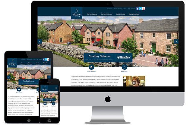
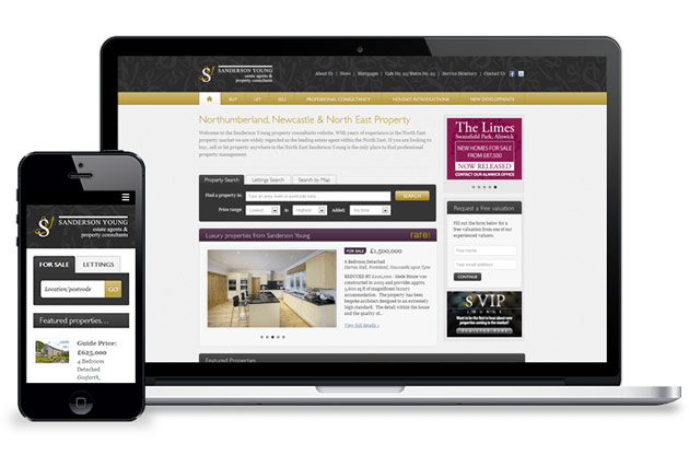
A responsive website for Storey Homes
Conclusion
I think it’s fairly obvious by now that we love responsive websites, we’ve been building them right from the start, so have masses of experience, hence we’ve got lots in our portfolio.
For more details, please don’t hesitate to contact us and we’ll be more than happy to talk about your project.