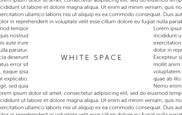
White space has become increasingly popular in web design. The most attractive and appealing website layouts these days have plenty of it. They’re using it to create a trendy minimalist aesthetic but it’s so much more than just a fashionable feature.
To begin with white space doesn’t actually have to be white. It would be more accurately described as negative space; the absence of text or graphics on a page. It can be used to create a sense of style while simultaneously setting a structure with a focus, and enhancing usability. At the very least it’s generally considered more sophisticated than cramming a load of stuff onto a page and expecting your users to decipher it themselves.
Using negative space allows the reader to see the information comfortably and easily but, more than that, it enables you to control what someone is most drawn to on the page. Use it to emphasize your points and define your priorities by clearly displaying your most important aspects. This is known as ‘active white space’, when a design actively utilises the empty space to direct the eye. If you’ve spent time on your content wouldn’t you want to know you were presenting it in the best possible way? Trust in your content and allow it to stand out. Crowding it all in prioritizes nothing.
It’s important to create a sense of balance and reduce the chance of a visitor arriving on your site, being overwhelmed by clutter and bouncing straight back off again.
Giving each section of the page it’s own space to breathe ensures that the user feels like he or she also has some space, and time, to comprehend what you’re trying to put across. It helps engage your audience, whether through the active spacing of images or the passive gaps through the text and between paragraphs.
This kind of clean design also takes into consideration the responsiveness of your site on multiple devices. You want to simplify things because otherwise it can quickly become impossible for anyone to view on a smaller screen. If you think a cluttered design is difficult to navigate on a desktop, it’s a whole other beast on a pocket-sized smartphone.
Web design can be a complicated concept but white space helps keep it simple for your users at least.
If you think your site could do with de-cluttering, and would like our team to take it look at it for you, then get in touch to arrange a meeting. We’d love to hear from you.