At Union Room, we are lucky enough to design websites for clients of all shapes and sizes, across a number of sectors. As our portfolio proves, one week we can be launching a new website for the largest auction house outside of London, and the next we can be helping a financial services organisation based in Nairobi advertise their services to potential investors. The visual and interaction design challenges that we face when working on such varied projects are unique to that particular product, however whilst we approach each project with this in mind, we do have a loose process which we adhere to that we have refined over our 10 year history.
Although we have broken our process down into five high-level steps, there are countless methods and smaller processes which are contained within each one of these and I wanted to talk about a particular aspect of our interaction design stage which crops up quite regularly on our projects. Content-first design is something that, over time, has become increasingly important in the way that we produce work at Union Room, even more so with the rise in non-desktop website usage and the adoption of responsive website design principles.
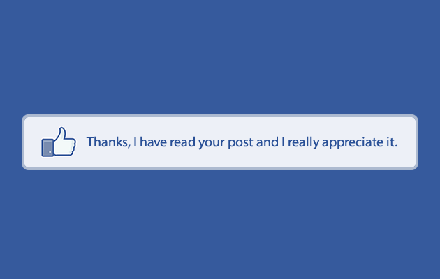
How the Facebook ‘like’ button might have looked if the team hadn’t decided on the content first!
At its core, content-first design is all about putting your content at the centre of your website’s user experience. The purpose of a website is to provide a way in which users can consume it’s content, whether it be text, imagery, video or sound, and building your website around that content can improve engagement statistics and increase the chances of a positive impression on users.
Why design first, content later doesn’t work
The early stages of a project are exciting, ideas are flying around and anything is possible with a blank canvas. This enthusiasm can sometimes increase the desire to see visuals for the website, so that stakeholders can get an idea of where the project is headed and alleviate any concerns that may still linger about how the final product will turn out. However, the early stages of a project should be all about understanding objectives, defining deliverables and learning about your business, not producing mock-ups of how things could look (sometimes we are asked to produce visuals for websites before we are even commissioned on a project, this is called speculative design and you can read about our thoughts on that too).
It’s at the planning stage of a project that success can be defined, mocking up a few quick ideas without real content can seem harmless at the time but can cause countless headaches further into the project. Without the content at our disposal, a mock-up may have eight lines of text introduction to your website with a small image to the left of that. This may look great on the mock-up, but what if your real content actually requires just three lines of text, and you don’t have an image that works well at a small size? The design that we created is essentially broken, and both parties have wasted time.
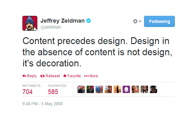
Jeffrey Zeldman, author of Designing with Web Standards, stated that ‘design in the absence of content is not design, it’s decoration‘. We like to keep this in mind throughout a project, and ensure that a website is not just looking good but it is easy to use and intuitive. Content-first design supports this approach, allowing us to concentrate on usability first, and ‘decoration’ second.
In practice
An example of content-first design on a project of ours is visible on Story Homes. In the screenshot below, you will see an example of how designing content-first can make things easier and result in a better experience for the user.
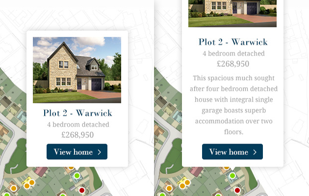
The content of this panel was decided well in advance of us reaching the visual design stage, as Story knew that users would want an image, plot number, property name, bedrooms, property type and price at this stage. If we hadn’t established what was going to appear in this panel before moving to visuals, we may have presumed that Story would have wanted to show additional elements such as a text description of the property. If we had designed this panel before establishing what content was going to be used, we would have then had to squeeze all of this additional information into the same space to prevent us having to redesign the panel and waste the time spent on this so far. As you can see, the revised visual doesn’t look great.
The example here is only one small aspect of a website’s design. Imagine this issue applied to whole sections of a website, the knock-on affects can be damaging to both the budget and delivery of a project.
Take a look at our work which showcases some of the projects that have benefited from this approach.